

BTS in The Studio: Part 2
The journey of creating the artwork: "Nobody's in Charge of Me"

This week is opening night and I’m excited to be showing the three pieces I’ve been sharing and hinting at for the last few weeks. Two weeks ago, I shared the piece that started it all off—called “Can you Hear the Rain, Love?” And today, I’m sharing another piece from my collection: Transformations with you!
All about the meaning
Something unexpected that art has been teaching me lately is how creativity can support a healthy sense of self and assertion. As I look back on how I was raised, those bits were the first to get squashed. As I’ve grown and forged my own path though, I’ve been developing those parts for myself and art has helped me do just that.
One of the first realizations that helped me start that reclamation was that nobody’s in charge of me. I’m a whole-ass human with my own agency of choice, thought, and direction. Breaking free from the conditionings that keep us blind to that and bound to the expectations of others, is a challenging path—but oh so rewarding.
I created a piece that spoke specifically to that shift.
Although the challenges are there, and freedom comes from slow, dedicated growth rather than a snap of the fingers, something as simple as realizing YOU get to be in the driver’s seat can truly change it all.
This is “Nobody’s in Charge of Me”
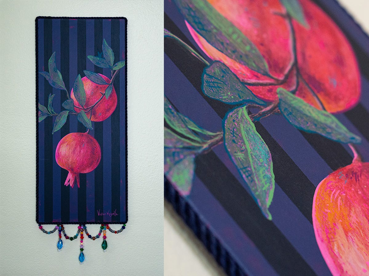
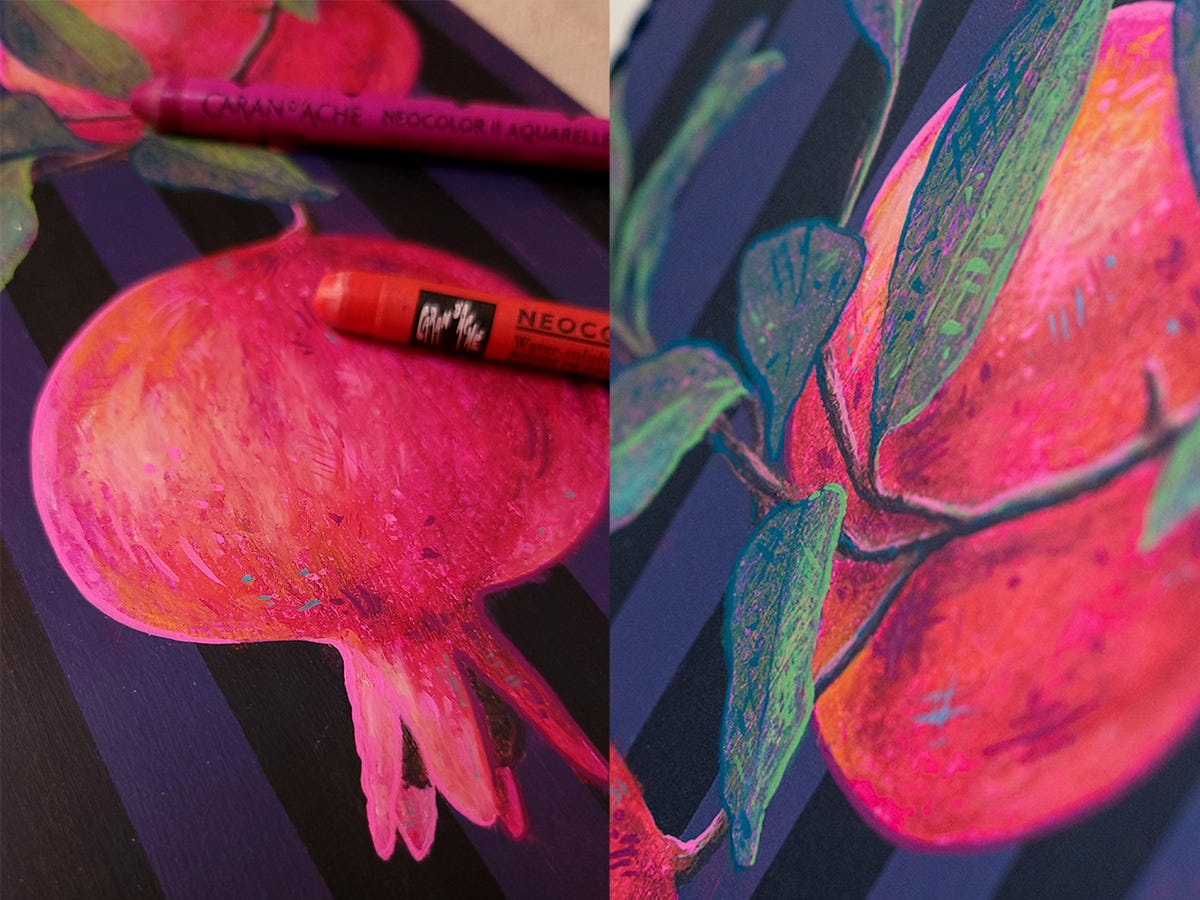
At first glance, this bundle of pomegranates might appear to be a quaint still life, but you know I love my layers… visually and conceptually speaking.
The background was the first thing I saw in my mind’s eye as I got started. The stark, crisp stripes speak to the essence of restriction and oppressive energy—which are a nod to where I originally found myself as a young person. The juxtaposition of the organic elements reminds me of a tenacious weed growing through barren, inhospitable environments such as brick or cement. There are some weeds that will always find a way—and to that I relate.
Pomegranates are full of symbolism themselves. Whether based on story, tale, myth, or culture, the essence of transformation, cycles, and rebirth is often associated with the fruit. Notably a feminine energy as well, which I found fitting as the piece represents tenacious youthful energy growing through challenge.
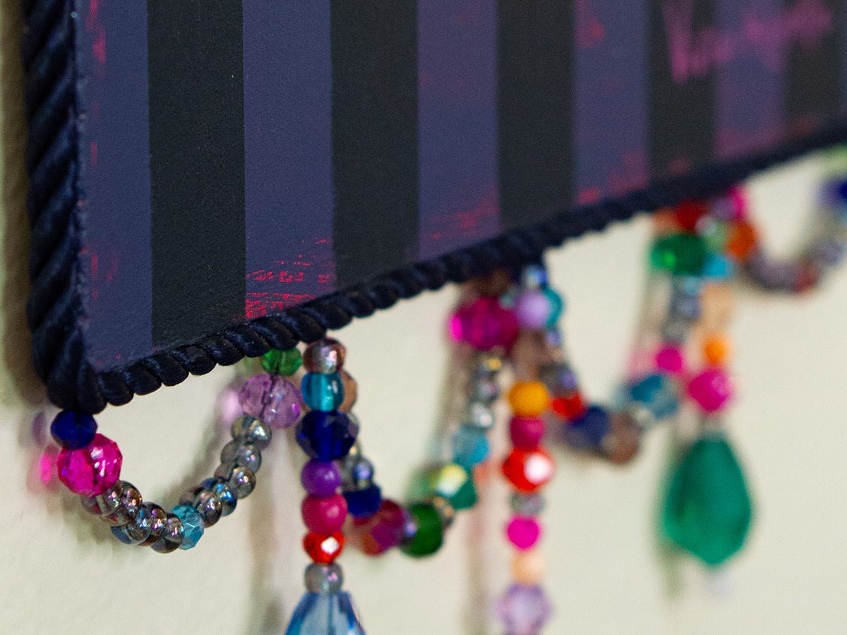
There are two additional features that might have caught your eye. The delicate beadwork as embellishment and… the tiny bunny silhouette I hide in almost all my works!
Even as I sit here thinking about the… we’ll say difficult environment I’ve grown through, I still see the beauty within that painful journey. It’s true that these experiences shape us, but for those who dare, we get the chance to REshape ourselves. And that magic is always worth celebrating.
BTS in the Studio: process of creating
At first, when I searched through my photos for this piece (and found almost none), I was a little disappointed in my lack of capturing the process… but on the other hand, that means I was really IN it, you know? The times that we lose ourselves in the process are often an indication that profound attention is flowing through to what we are making. And things do seem to thrive with extra special care and attention, don’t they? So instead of being disappointed in the sparse photos, I’m choosing to see what was really going on between me and this piece.

You know what got me interested first?
The shape of the panel. The tall, skinny composition felt striking to me.
You know where the panel came from?
The insulation from a flat-pack piece of furniture. 😂
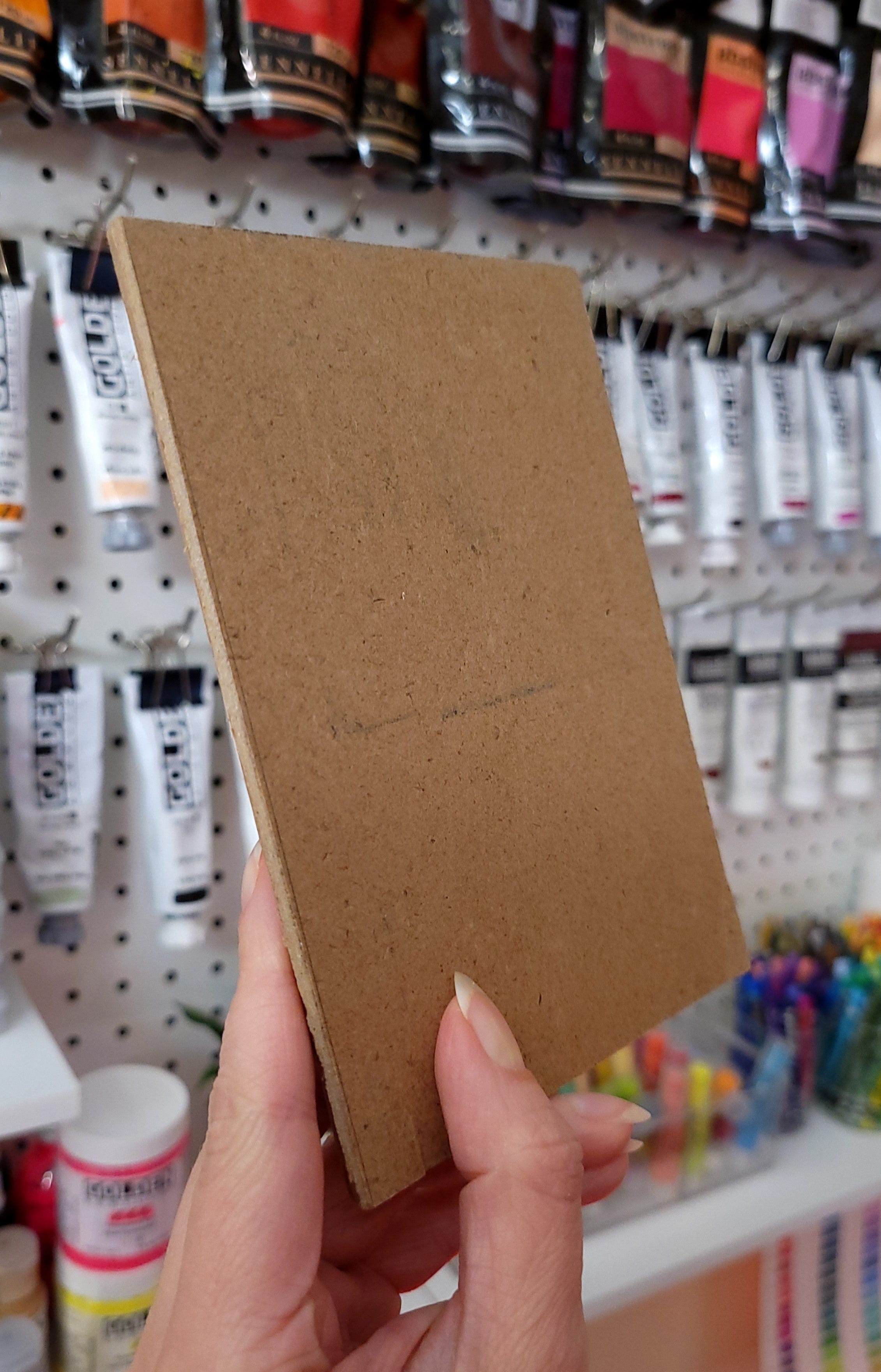
In a stroke of luck, I was already planning on using the exact same substrate—a pressed hardwood panel—but I hadn’t gone to the hardware store to pick one up. Next thing I know, I’m unpacking an organizational cabinet and these long sections of the same hardboard are in there as a little gift to me from the universe. Granted, they are all long and skinny, so that might be a compositional theme for a bit, but I’ll take all the luck I can get.
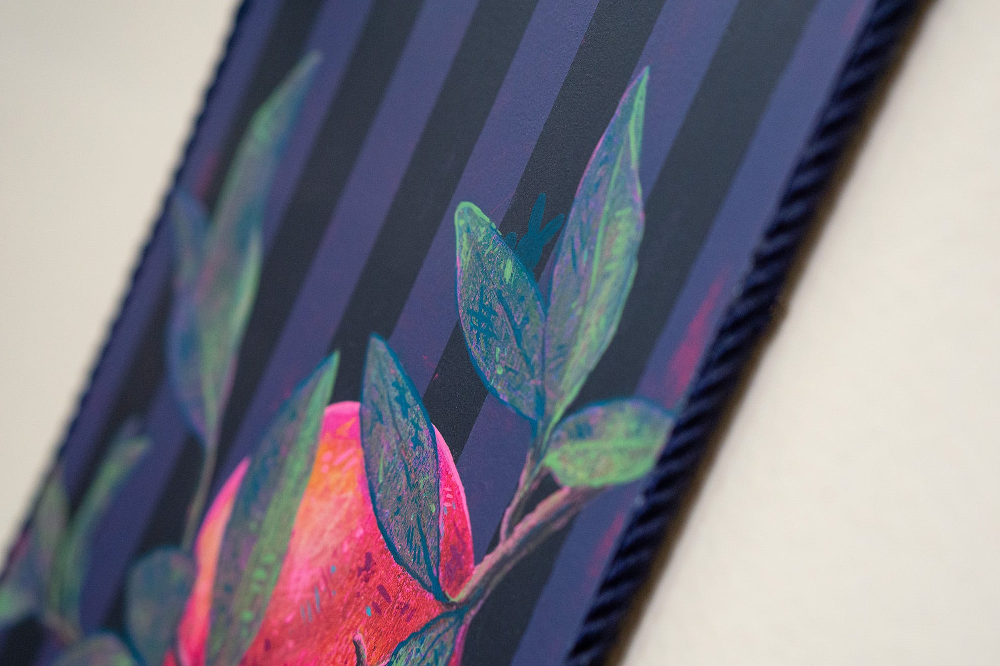
After priming the board with gesso, I painted it a HOT pink as my underpainted tone. I love letting the visual heat from florescent paints peek through the more “normal” colors on top. It creates such a luminosity without overwhelming the senses.
At this point though, I didn’t really know what I was going to make it into. I’ve been trying this thing where you trust that the next creative step will reveal itself. And that can happen in a variety of ways—a vision of what something looks like, feeling curious about what might happen if you try something, or the simple delight over a tool or medium that carries your creativity forward.
With this approach (that definitely would have freaked my old self out), it wasn’t long before I saw the vision of how crisp stripes might look as the background. Working with the tall, skinny composition enhanced the looming nature of vertical stripes. Taking care to ensure those stripes still felt like a background element though, I decreased the contrast by using shades of inky indigo that were a little closer together. This would help frame whatever was layered on top, without overpowering it.
Following my curiosity of juxtaposition came next. My design eye kicked in and I considered how “power clashing” patterns is often visually engaging. So what would I power clash with stripes? Something curvilinear and organic, of course!
I often gravitate toward florals but when I came across pomegranate images, the theme of transformation and growth all started to come together. This is when the concept really started to crystallize, which is still so different to me. For so many years I would always plan out my concept as a target to aim for. But that approach didn’t allow for freshness to come through or my curiosity to be an asset.
What Tools I Used:
I drew in the pomegranates and leaves with Carandache Neocolor II French Artist Crayons and then added line work out of custom acrylic colors. I love the opacity that acrylic can offer for graphic line work, but getting the right consistency can be challenging. I usually aim for “melted ice cream.” Kinda “slideable,” flat, but still opaque.
The final touches came at the end with the beadwork and embellishment. I knew I wanted to go for an unconventional way of framing the piece, so I found exactly what I was looking for on a very fun hunt in the Garment District of Manhattan.

Overall, this piece speaks to resilience and the ability to shed the things that hold us back. And much like that uncharted territory, creating this piece brought me through an unfamiliar, challenging, yet rewarding journey.
If this concept is one that speaks to you, perhaps it’s calling to be nestled on a wall in your space—to remind you every day that transformation is a process. Message me to collect this special piece!
Also, I’d love to invite you to come see the piece in person at Culture Lab LIC for their affordable holiday fine art show. The opening reception is this Thursday, Nov 6th from 6-9pm. On view through Dec 14th, 2025.
To transformation, my friends.
Until next time. Create bravely and keep betting on yourself.

P.S. If you’d like to see more of my art and peek into my creative life, come follow me on Instagram. 🌹